By Maria Dubuc, President, Marketing by Design
As an owner of a creative branding agency, I can never seem to stop exploring the market trends in retail brands. In doing so, I’m often delighted and surprised by the amazing branding work by packaging professionals globally.
I love to learn where artists get their inspiration. And as an explorer, I find art just about everywhere! Supermarkets are like a museum to me. I often purchase items for the packaging, whether I need the product or not. In the end, I spend far too much time roaming the aisles exploring and far too little time following my list. Shout out to my husband for taking the actual task of shopping over from me years ago!
My favorite times of year is when the Vertex Awards roll around. As a judge, I’m glued to the screen for hours at a time, day after day, studying and enjoying the content and character of the brands and package entries presented. It’s inspiring, educational, and overall a great time for me!
My recent observations show that retail brand design and innovation are at an all-time high. And as I’m sure many of you have noticed, retailers are raising the bar by and spending the time, effort [and funds] required to create great package design that resonates with consumers.
Has the pandemic affected these trends? Undoubtedly yes.
But the general mood is the same, and the strategies set forth before 2020 remain strong. That is despite cost implications which of course are a factor. (a discussion for another issue).
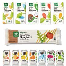
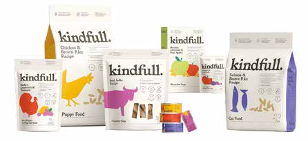
Leaders like Target and Whole Foods aren’t backing down from their redesigned programs. And several fast followers fit with what I see as the most recent design trends – bright packaging, bold graphics, patterns, illustrations– could it be it’s anything that will to help consumers forget about the last couple of years? Target introduced Kindful in Aug. 2021, another extension of this thinking, so it must be working. If I were to use one adjective to describe the state of package design today, I’d choose Optimistic.
I’m happy to report that’s what’s going on in our studios these days! We proudly create an abundance of optimistic and great-looking packaging for our group of highly enthusiastic clients. It’s not only the consumers who help shape the market; it’s the brand owners who listen to them and respond to change!
Lately, it’s not just about optimism in color pallets and graphic elements that are trending; it’s about properly speaking to the customer about the product attributes and features; what are the reasons the product was chosen for your customer? Why will they enjoy it more than the competing brands? What benefits will it provide? And by all means, be honest and don’t be afraid to be yourself; differentiation is another word I use daily..
Each item has to speak with its voice. I’m not going to lie; the idea of SKU by SKU specifics creates a worry for retailers and suppliers who have to pay for each iteration. However, our clients report that the return on investment comes with increased sales.
In this article, I will talk about and share with you (where I am able) some examples of what we see trending.
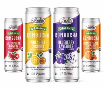
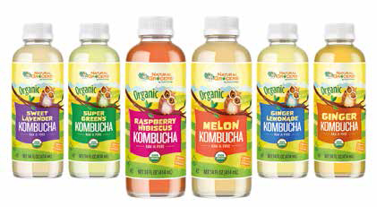
Let’s start with one of my most recent items hitting the shelves for Sprouts Farmers Market.
Kombucha depicts punchy, colorblocked flavor imagery and sweeping color bars that create a bold, bright design with all the necessary category cues that are highly shoppable.
Let’s step away from MBD and look at what’s in store globally from my findings judging Vertex. Note: I don’t think I’m the oldest judge, but I’ve been judging for the longest time. Therefore, I’ll include some history I feel is still relevant today.
Re-Inventing the categories
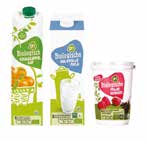
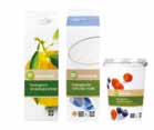
Over the past 5 years I’ve witnessed a trend of differentiation from category norms. In 2016, Albert Heijn not only redesigned their dairy line, they got playful and breathed new life into a category that struggles with status quo design and complex print processes.
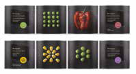
In 2021, I was impressed with how El Corte Ingles surprised us with their canned vegetable line of products. I’d love to know how they are performing and what their customers think!
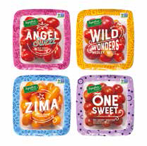
This year, Albertson’s did a nice job reinventing their grape/cherry tomatoes line. Notice the bright color palette, playful patterns, creative typography, and the copy that communicates each item’s unique attributes and characteristics.
Profi in Romania had fun with their redesigned line of fresh eggs. Personality, whimsical expression, and a unique color palette for this category helps these products differentiate and really pop.
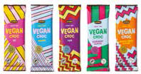
In the Netherlands and Belgium, Jumbo developed this line of Vegan Chocolate bars that supports my theory. Bright colors, patterns that are unique SKU to SKU. Can you imagine how packaging like this is so much easier to socialize?
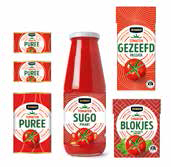
Last year, Jumbo did something similar with their line of tomato of products. The judges loved the results and gave this lineup a silver award.
Be playful and have fun!
We are still seeing the ‘fun’ and ‘playful’ trend in the marketplace. Customers want to be happy, smile, and what makes them laugh will surely end up in their basket.
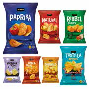
In 2021, Jumbo in the Netherlands clearly had fun with their “couch potato” chips line. Super interested to find out how they performed. I’m sure these would be among the items I’d impulse buy and try!
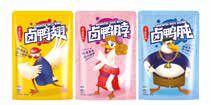
One of my favorites from Aldi China from 2021 are their marinated duck items which won a Silver.
I love how the Natural Grocers allowed MBD to spread our wings and have some fun with their brand. This brand won gold in 2019.
The Kombucha category was entered this year with an ‘eye-opening’ experience for their shopper! I hope it’s a winner this year too!
What’s next? Where is package design trending?
From what we are working on today at MBD, I expect to see more of the same. A couple of final examples from Vertex 2022 will illustrate this point.
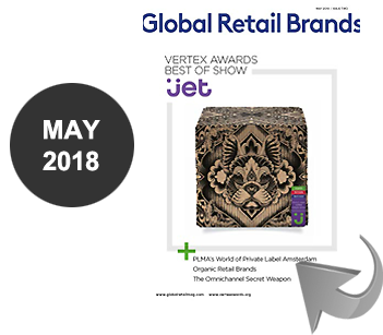
Remember when Jet.com came out with their custom illustration brand with hardly any branding or copy, just beautiful graphics and patterns with a small Uniquely J lock up? And Boxed Prince & Spring brand with their exciting designs and clever copy to draw them in and amuse their customers?
Well, today we have Foxtrot. A new chain of upscale, delivery-focused corner stores and cafés that started in Chicago and is making its way across the country. Owning their personality and clearly differentiating in their market, I’d be surprised if these items don’t steal the show for Vertex this year. Here’s a sampling of my favorites from judging. So simple and so on brand, nice work Foxtrot!
I’ll end with an entry that knocked my socks off from Line Stores in Ukraine. This entry speaks for itself. Someday I’d love to meet the team who got this approved and on a shelf in 2021! My hats off to them, and we wish them the best of luck.
I hope you found this interesting and look forward to seeing you again soon, in person, virtually, or in this magazine. MBD is ready for and embraces change and will never ever stop exploring.
MBD
Since 1990 MBD has been on a mission to produce stand out packaging. We are intensely focused on the needs of our customers’ consumers. With Creative Strategy and Workflow Management expertise we set forth with one goal in mind: Create award winning design with a positive experience for our customers. We set ourselves apart by being brand ambassadors for our clients. We are retail obsessed, have a passion for innovation & storytelling and have a commitment to operational excellence.

