SGK Amsterdam’s objective was to completely redesign Superunie’s organic retail brand BIO+ to help modernise the brand and appeal to a wider audience. The existing brand logo, while appropriate for early adopters, was reminiscent of first wave organic ranges with overt pharmaceutical cues. Consumer expectations have since driven the category forward into a far more mainstream space and BIO+ needed to respond in order to maintain relevance. The team would also need to bring consistency to the brand uniform across the wide range of products to ensure BIO+ had maximum stand out on shelves across the store.
Consumers buy organic products to feel good, both in relation to the quality of the products but also to help reduce their negative impact on the planet. Giving BIO+ a contemporary, uplifting and confident visual positioning was key — all while improving visibility and recognition.
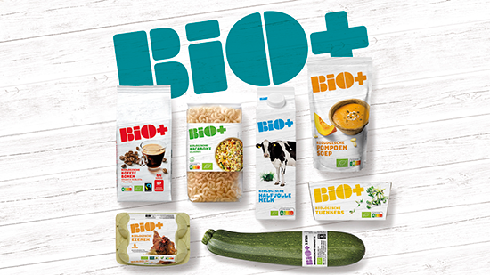
The building block design of the new BIO+ brand logo provides a degree of light-hearted energy and, in combination with the bright and lively colour palette, has helped boost the brand to become far more modern, cheerful and approachable. The significantly larger and distinctive shape of the brand logo brings confidence and ensures instant stand out and recognition on shelf across all categories — amplifying the brand name to simultaneously strengthen the proposition. Designing the brand logo as a stand-alone icon on pack provides the necessary flexibility to work across a multitude of categories; adapting the colour of the logo to aid range and variant navigation and avoiding the need for additional colour codes, and therefore inks, on pack.
The clean white wooden background and uncomplicated product photography align with the straightforwardness of the brand and the naturalness of the products, helping to communicate honesty and purity as well as giving the brand logo space on pack for additional stand out. Having created the strategic design for a core of 26 sku’s ready for a roll out across over 350 sku’s, SGK Amsterdam also designed a Print Ad and a selection of POS materials for use in store to help further amplify the impact of the new look and feel for BIO+.

“It was a real pleasure partnering with the Superunie team to help the BIO+ brand make such a big step forward. Amongst other things, designing the brand logo as a stand-alone icon on pack provides the necessary flexibility to work across a multitude of categories; adapting the colour of the logo to aid range and variant navigation and avoiding the need for additional colour codes, and therefore inks, on pack. Simplifying the packaging design in this way has helped amplify its impact on the shelf.”
– Marcel Verhaaf: Executive Creative Director, SGK Amsterdam
For more information:
Simone Bergman
SGK Amsterdam
[email protected]
Kirsty Cole
Orbis Creative Communications
[email protected]