by Devon Baker, Account Manager, MDB
Over the last 2+ years, Marketing by Design (MBD) has partnered with Sprouts to completely transform their approach to package design and bring to life the true personality of Sprouts Farmers Market. Throughout the beginning stages of the redesign, MBD worked hard to lay the groundwork of an elevated look that remains friendly and approachable and gets customers excited to shop at their local Sprouts. There is no shortage of unique and differentiated products throughout the store, and Sprouts’ goal was to have the packaging design catch the eye of the shopper and instantly communicate something elevated and different.
As the MBD team established category and line looks, we found ourselves having fun with the designs and addressing challenges along the way. From retrofitting “tiered” design approaches to working on line extensions, our efforts have shifted but the goal has remained the same.
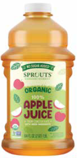
100% Fruit Juices
The goal of this line redesign was to establish a brand block in the 100% juice category, while maintaining different premium levels, across both conventional and organic. Our 100% apple juices (from concentrate) start off the tiering with a slightly more playful approach, speaking to parents who may be buying these items for their children. The tiering steps up a level for the 100% apple juice (not from concentrate), with more serious fonts, illustrations and color palettes. The NFC 100% apple juices helped bridge the gap between the more playful approach in our first tier, to the most premium level of 100% juices (NFC). With the use of white, sophisticated line illustrations and serious fonts, our artists are creating a brand block of premium juices, which are easily shoppable. We chose to allow conventional and organic to sit closely together from a design standpoint, as both levels are premium and do not need to be further differentiated.
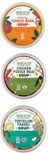
Deli Soups
The deli category has proven itself to be an exciting and interesting category to work through. For the soup, MBD wanted to communicate a freshness for the category, while toeing the line of playful and premium. The use of white across the top with color blocking across the bottom allows the items to pop off the shelf and draw the shopper in. With a very small PDP, our designers wanted to find creative ways to include flavor cues and required regulatory information. Having our illustration style come in from the sides like a border allows for the information to be centralized and easy to read.
Italian Risottos
Navigating through not only the frozen category as a whole, but more specifically the Italian frozen meals, has been an exciting endeavor. The frozen risottos joined our family of ravioli, stuffed gnocchi and saccottini pasta. MBD wanted to identify where our designers could utilize colors that exist within those sets, while still having these items stand out on their own. Photography is the cornerstone of this project, as it effortlessly highlights the decadence that many frozen items lack.
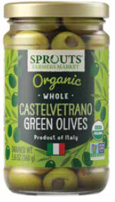
Jarred Olives
The challenge our artists faced with the jarred olives projects was to have this item live on its own, but also fit well within the pickled vegetable and jarred pickle category they sit in. The jarred olives became one of those unique products where the MBD team is retrofitting them into a nearly complete set, while giving them their own identity. Knowing how important shopability is to Sprouts, our designers needed to create a system that clearly identified form (whole, stuffed, pitted, etc.), type (green, mixed, kalamata, etc.) and flavor (smoked, red pepper, jalapeno, etc.). Our color system spoke to the color of the olive in the jar, which is a nice combination with the product you can see through the jar. With pops of color for the flavor and each form sitting in the same font above the product name, our artists created a system that communicates the premium nature of these items, while allowing the consumer to easily identify the item they’re searching for. Sitting at the bottom of the uniquely shaped holding vessel is the country of origin.
Each year our team works through the redesign with Sprouts and designing packaging for new, innovative products. We work together as partners and face new challenges, accomplish new goals and establish even more of Sprouts’ special personality throughout each store. The team at MBD can’t wait to share what is to come!
Devon Baker Devon has 7+ years in the design and advertising industry, focusing her last 3+ years on food and beverage package design. As an account manager at MBD, she enjoys working on a variety of clients, with very different brand needs and helping them to communicate their brand’s personality and values through package design. She is always looking for ways to connect deeper with her clients, to foster relationships of trust, ambition, and enthusiasm.